BitCrunk IT Solution is a web marketing agency that offers SEO services, PPC services, social media marketing services, web design services, web development services and a host of other online marketing services.
Location
+91 866 8324 946
Plot No. 341, Mudliyar Nagar, Amravati- 444606
Opening Time
Monday: 10:00am - 07:00pm
Tuesday: 10:00am - 07:00pm
Wednesday: 10:00am - 07:00pm
Thursday: 10:00am - 07:00pm
Friday: 10:00am - 07:00pm
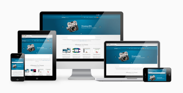
Responsive Web Design Company in india
With more than 68% of the audience surf internet over their handful devices like- Tablet, Smartphones, and Phablets, your customers have already changed, & you can’t afford to lose this huge number. But, it’s also a fact that your broken and ugly site on mobile is not gonna impress these users anymore. You just have less than a second of time. If a user browses your website over their tablet or Smartphone, they must have easy and trouble free experience.
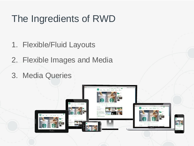
Responsive Web Design Services and its Features:
We as a responsive web design company India, implement responsive web design features which help business and customer. Go beyond the traditional web boundaries to explore an exciting world where the designs will fit every browser-operated gadget. Few features of best responsive web design services are mentioned below.
# Navigation: based on the browser width, the navigation is at different locations.
# CTA: prominent display of call-to-action is an important feature of successful responsive site design.
# Columns: responsive sites scale ads, headlines, images, and text in right proportions. It also maintains design integrity upon browser resizing and initial presentation to users.
# Whitespace and padding: proper hierarchy of information on the page is a part of responsive site design.
# Branding: when building for mobile versions the design is for 3-4 standard widths. It reflects brand in all sizes.
A sneak peak of some imperative benefits of responsive web design.
Recommended By Google
Google states that responsive web design is its recommended mobile configuration.
Highly Flexible
Since responsive websites are fluid, content can freely move adjusting the size of the device.
Excellent User Experience
With people are short on time, a responsive website reduces their manual efforts of searching things and serve what exactly then need on their preferred device.

Low on budget
With one website compatible with all the devices, you’ll have no expenses of creating the website for each device particularly.

Reduces the Bounce Rate
Since a responsive website is designed with optimal user experience, regardless of the device website is being searched on, it’s pages automatically gets scaled according to its size. And the user gets the exact information that they require.


Copyright © BitCrunck InfoTech Solutions. All Rights Reserved